
File:Comparison of male and female life expectancy -world.svg

此SVG文件的PNG预览的大小:512 × 407像素。 其他分辨率:302 × 240像素 | 604 × 480像素 | 966 × 768像素 | 1,280 × 1,018像素 | 2,560 × 2,035像素。
原始文件 (SVG文件,尺寸为512 × 407像素,文件大小:85 KB)
摘要
| 描述 |
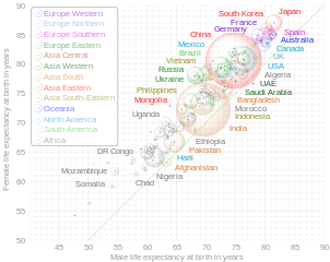
English: This is an interactuve bubble chart of comparison of countries by life expectancy at birth according to estimation of the World Health Organization for 2019. Open the original svg-file in separate window and hover over a bubble or lettering to highlight related content and to see detail information. The diagonal green line corresponds to equal female and male life expectancy. Square of bubles is proportional to the population of countries, according to estimation of the United Nations for 2019 (link 2). The diagram shows only countries with population of at least 1,000,000 people. Grouping of countries to subregions is according to the classification of the United Nations. This is a derivative work of the diagram "File:Comparison gender life expectancy CIA factbook.svg". |
| 日期 | |
| 来源 | 自己的作品 |
| 作者 | Lady3mlnm |
| 其他版本 | Russian version |
许可协议
我,本作品著作权人,特此采用以下许可协议发表本作品:
| 本作品采用知识共享CC0 1.0 通用公有领域贡献许可协议授权。 | |
| 采用本宣告发表本作品的人,已在法律允许的范围内,通过在全世界放弃其对本作品拥有的著作权法规定的所有权利(包括所有相关权利),将本作品贡献至公有领域。您可以复制、修改、传播和表演本作品,将其用于商业目的,无需要求授权。
|
文件历史
点击某个日期/时间查看对应时刻的文件。
| 日期/时间 | 缩略图 | 大小 | 用户 | 备注 | |
|---|---|---|---|---|---|
| 当前 | 2022年6月10日 (五) 06:05 | | 512 × 407(85 KB) | Lady3mlnm | Dotted diagonal line is changed to translucent solid line. Inner structure is improved. |
| 2022年5月28日 (六) 15:39 |  | 512 × 407(81 KB) | Lady3mlnm | The chart made more accurate | |
| 2022年5月26日 (四) 20:11 |  | 512 × 407(81 KB) | Lady3mlnm | Fixed small bug with size of canvas | |
| 2022年5月26日 (四) 18:57 |  | 512 × 448(81 KB) | Lady3mlnm | Uploaded own work with UploadWizard |
文件用途
以下页面使用本文件:
全域文件用途
以下其他wiki使用此文件:
- ar.wikipedia.org上的用途
- da.wikipedia.org上的用途
- de.wikipedia.org上的用途
- en.wikipedia.org上的用途
- en.wikiversity.org上的用途
- fa.wikipedia.org上的用途
- ja.wikipedia.org上的用途
- ko.wikipedia.org上的用途
- la.wikipedia.org上的用途
- ru.wikinews.org上的用途
- tr.wikipedia.org上的用途
- www.wikidata.org上的用途